Politicians love to make claims about tax policy. This tax cut will create jobs! That one forced the school district to fire teachers!
But too often such claims are not supported with evidence. So the State and Local Finance Initiative made an interactive tool that gives you—whether you’re a policymaker, journalist, researcher, or voter—the power of data. The updated State Economic Monitor lets users graph, analyze, and share statistics on state employment, earnings, gross domestic product (GDP), and housing—and for just the states you’re interested in.
Before you take it out for a spin, I’ll show you how the updated tool can provide evidence for three tax policy issues. Hopefully, you’ll then use it to make customized graphs for your next memo, presentation, or tweet about state tax policy.
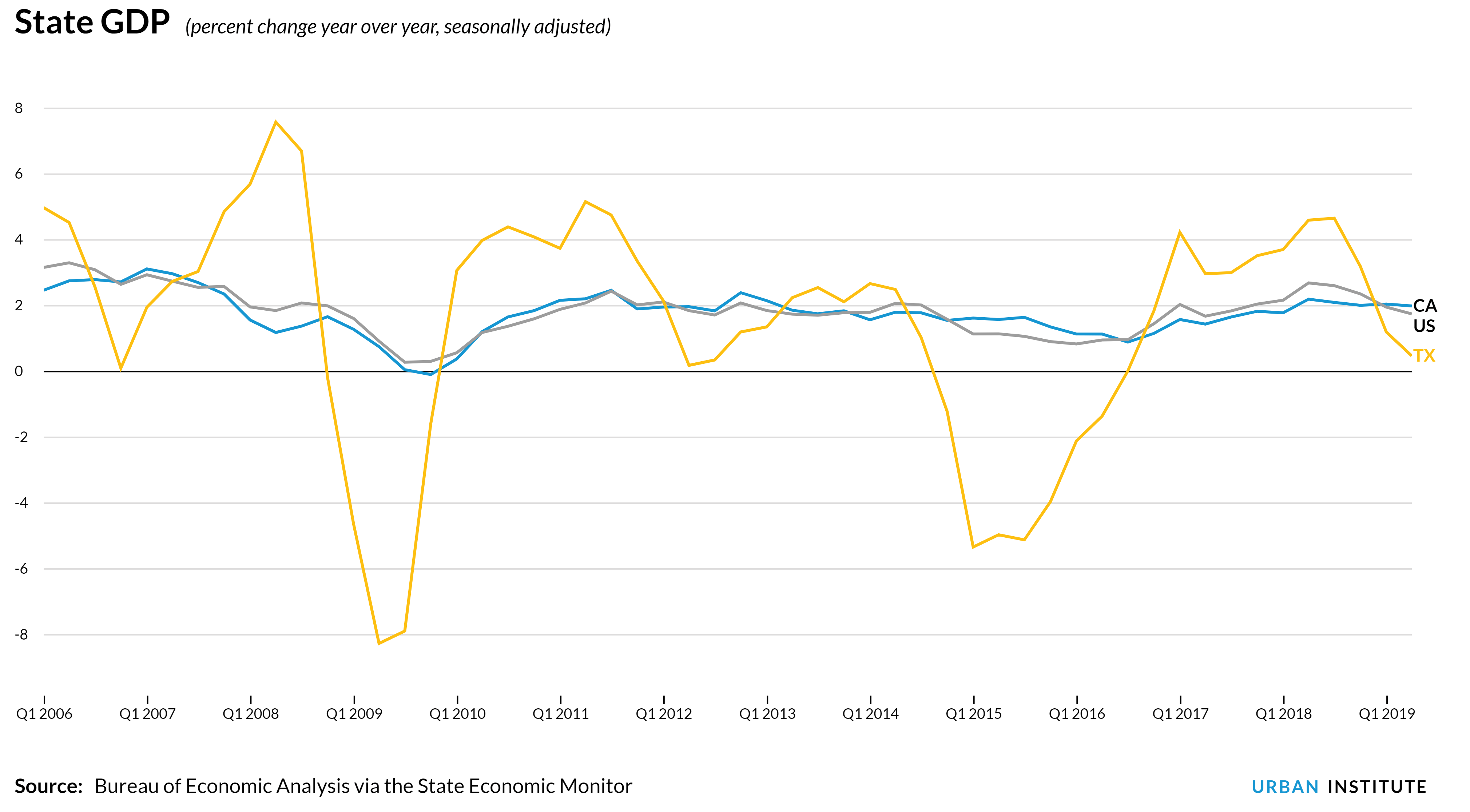
California vs. Texas
This is always the heavyweight fight in state tax policy. Which is the better model: California’s progressive income tax and the extensive services it pays for or no-income tax Texas and its relatively modest services?
To help us understand this question better, let’s look at each state’s year-over-year GDP growth for each quarter as far back as we can with the tool.
(See the interactive chart here.)
California’s giant and diverse economy essentially tracks the national average over the entire period. But Texas’s economy repeatedly rises and falls, mostly because it’s dependent on the inherently volatile fossil fuel and mining industries.
In short, taxes affect each state’s economy but so do a host of other factors. Thus, it is important to remind people there’s a lot more at play than just a single policy lever. This graph also shows why you should never fall in love with one quarter or month of data. Always zoom out to see if larger trends are at play.
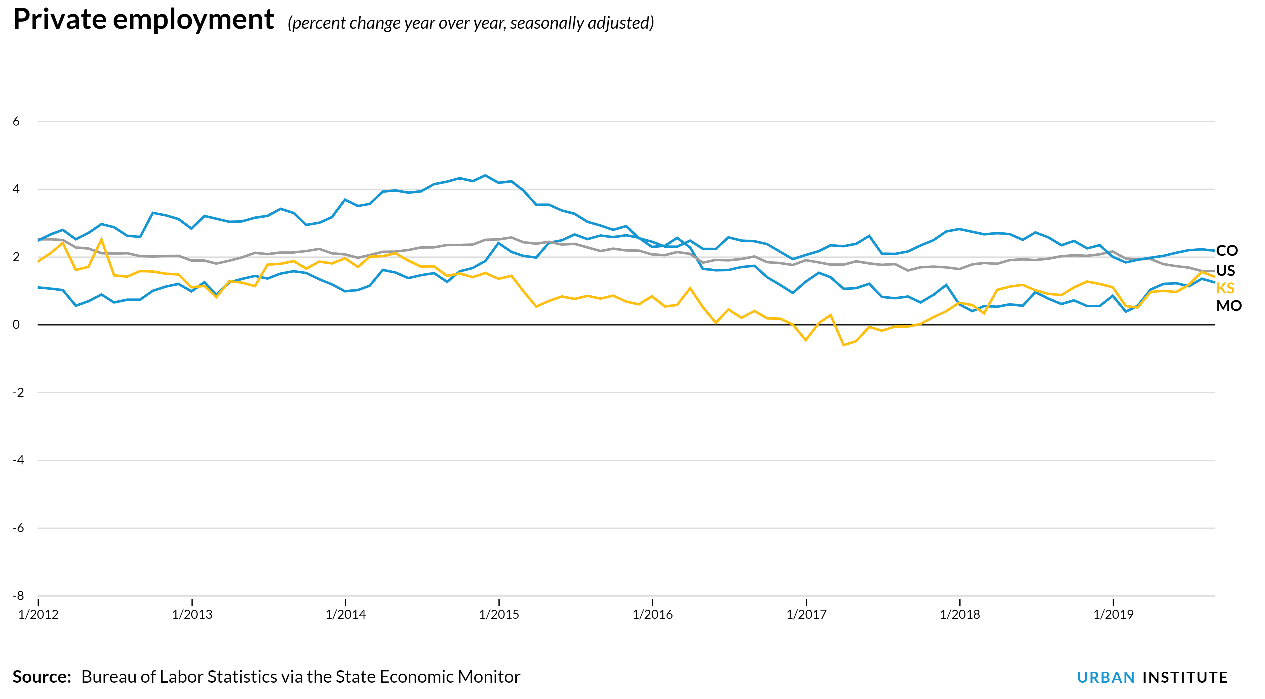
Kansas’s failed experiment
That said, sometimes the economic data do give a definitive answer.
This blog has picked on Kansas before (a few times, actually) but the data tell a powerful story.
In case you somehow missed it, in 2012 then-Governor Sam Brownback lowered individual income tax rates and eliminated taxes on pass-through businesses. Brownback infamously called his tax plan a “real live experiment” and promised his state an abundance of new jobs. How did it work out?
(See the interactive chart here.)
Soon after Kansas passed its tax cuts, the state’s year-over-year private employment growth dropped well below the national average and generally lagged neighboring Missouri. In 2017, Kansas lost jobs on net. What Kansas did see after the tax cuts were massive budget deficits.
In 2018, the legislature had enough and (overcoming a Brownback veto) repealed most of the tax cuts. The state’s job growth rate in September 2019 was roughly the same as the national average. The state is also no longer lamenting forced budget cuts but rather deciding what to do with its large budget surplus.
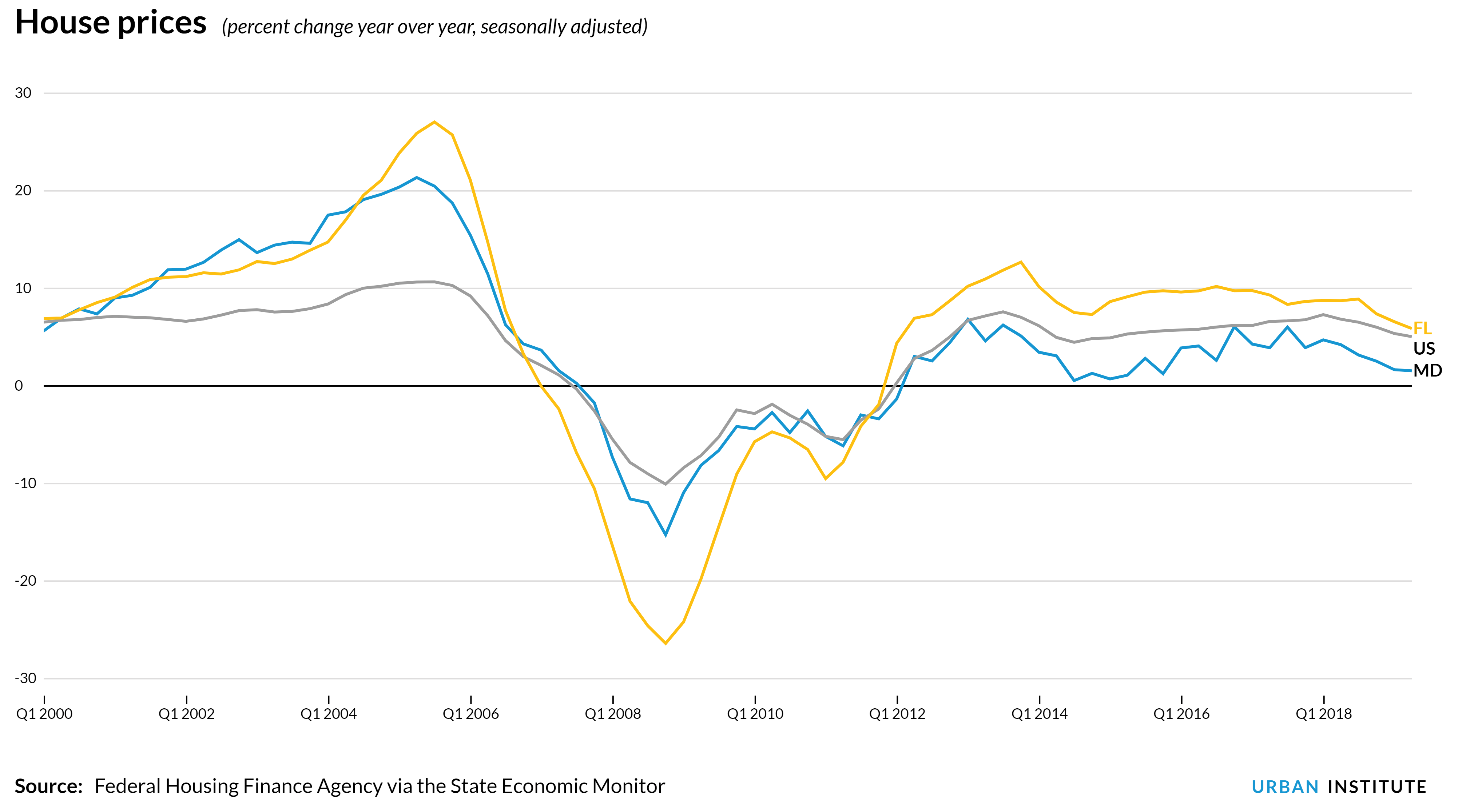
Florida’s rising property tax; Maryland’s search for revenues
Over the past few years Florida residents in numerous towns have seen their property taxes shoot up. Some of this is the result of policy decisions, but much was driven simply by increasing home values.
Our new interactive tool shows the dramatic fluctuations in Florida house prices before, during, and after the housing bubble.
(See the interactive chart here.)
At the state’s peak (third quarter of 2005) home prices were up 27 percent for the year. But during the depths of the Great Recession (fourth quarter of 2008) prices were down 26 percent. Florida’s nadir was worse than any state except California and Nevada. Since 2012, growth in Florida house prices have again exceeded the national average, and a return to higher home prices means higher property taxes.
Maryland is having a different problem. While Maryland home prices also grew faster than the national average during the 2000s, they never fell too far below the national average during the Great Recession. However, over the past five years Maryland’s house prices have grown slower than the national average. The resulting limited property tax revenue growth could complicate Maryland’s ambitious plan to increase education spending.
Try it yourself
With 50 states plus the District of Columbia, 10 datasets, and some data going back to 1977, there’s plenty to explore. To make it a bit easier, we made “highlight” cards at the top of the page that display some of the recent data trends we found interesting.
When you like the graph you’ve made, there are buttons to “save chart,” “share chart” and “download data.”
And the next time a politician makes a big claim about state tax policy, you’ll know where to go to evaluate it.
notes from the interweb